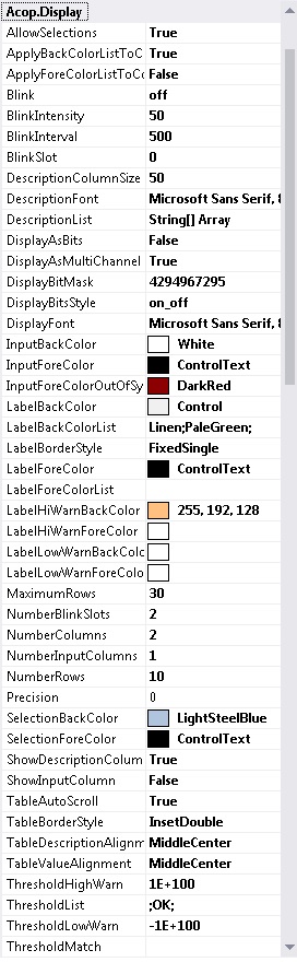
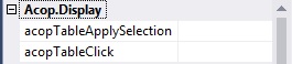
AllowSections if true: allow selection of table value cells and fire the Apply event in the context menu
ApplyBackColorListToColumns if true apply the BackColor List to column entries if NumberValueColumns > 1
ApplyForeColorListToColumns if true apply the ForeColor List to column entries if NumberValueColumns > 1
Blink set the blink mode for the table cells
- off (default)
- onWarning
- always
BlinkIntensity set the blink intensity for the table cells (up to 100% lighter or -100% darker) (default = 50)
BlinkInterval set the blink interval (msec) for the table cells (default = 500)
BlinkSlot set the blink slot for the table cells (0 up to NumberBlinkSlots) (default = 0)
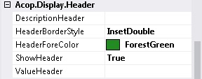
DescriptionColumnSize desired description column width in percent (if DescriptionHeader = true)
DescriptionFont Font to apply to the description column
DescriptionList supplies a specific array of description strings to use in the table Description column (else discovered from the target LinkAddress and LinkProperty)
DisplayAsBits if true: display bit breakdown (applies to a single link returning a number)
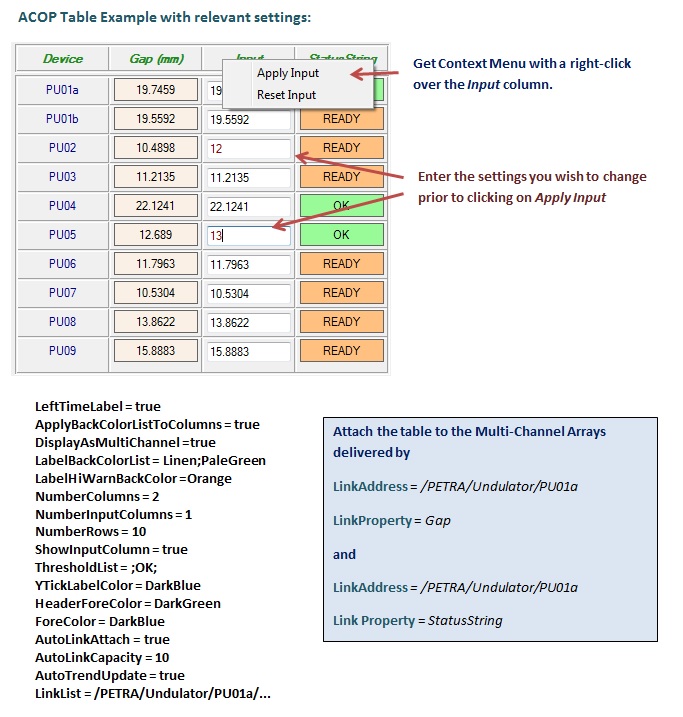
DisplayAsMultiChannel if true: assign each channel value in the target array values to its own table cell.
DisplayBitMask specifies a Mask giving the relevant bits to use if DisplayAsBits is true
DisplayBitsStyle determines how bit values are displayed in the table (if DisplayAsBits is true)
DisplayFont Font to apply to table cells
InputBackColor BackColor to display in the input column when it is shown
InputForeColor ForeColor to display in the input column when it is shown
InputForeColorOutOfSync ForeColor to display in the input column when it is shown and the data contents are out of sync with the readback values
LabelBackColor BackColor to apply to the value cell
LabelBackColorList specifies a list of background colors to use for value entries
LabelBorderStyle Border style of the value label cells within the table
LabelForeColor ForeColor to apply to the value cell
LabelForeColorList Specifies a list of foreground colors to use for value entries (see LabelBackColorList)
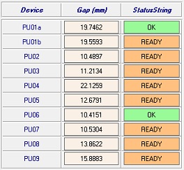
LabelHiWarnBackColor BackColor to use if number value is greater than ThresholdHiWarn or if string value does not equal ThresholdMatch
LabelHiWarnForeColor ForeColor to use if number value is greater than ThresholdHiWarn or if string value does not equal ThresholdMatch
LabelLowWarnBackColor BackColor to use if number value is less than ThresholdLowWarn or if string value equals ThresholdMatch
LabelLowWarnForeColor ForeColor to use if number value is less than ThresholdLowWarn or if string value equals ThresholdMatch
MaximumRows specifies the maximum number of table rows
NumberBlinkSlots set the number of blink slots for the table cells (at least 2) (default = 2)
NumberColumns initial number of table value columns
NumberInputColumns initial number of table input columns (less than or equal to number of value columns)
NumberRows initial number of table rows"
Precision precision to use for floating point numbers (0 = general display)
SelectionBackColor BackColor to display when a cell is selected (see LabelBackColorList)
SelectionForeColor ForeColor to display when a cell is selected (see LabelBackColorList)
ShowDescriptionColumn if true: show the description column
ShowInputColumn if true: show the value input column
TableAutoScroll if true: allow scroll bars if the number of table rows exceeds the table layout size
TableBorderStyle Border style of this acop table
TableDescriptionAlignment text aligment for table description cells
TableValueAlignment text aligment for table values
ThresholdHighWarn if the link data is numerical, then the threshold provided is used for comparisons with the monitored data
ThresholdList supplies a list of threshold criteria to be used for a set of grouped links
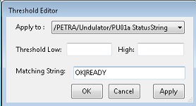
ThresholdLowWarn if the link data is numerical, then the threshold provided is used for comparisons with the monitored data
ThresholdMatch if non-empty and the link data is non-numerical, then the string provided is used for comparisons with the monitored data
ToolTipText specifies the preferred tooltip text for table. If un-specified, then the address parameters will be used.
Units the value units (applied to the component's description)
|