Other Beans Overview

DateSpanSelector

DateSpanSelector
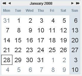
is a simple graphical widget for selecting date intervals. The component consists of a combo box containing months and years and a panel of labels indicating days in the selected month. The user can select date intervals by dragging the mouse over the chosen set of date labels. Selections of spanning over multiple months are possible by dragging the mouse outside the date panel area in the chosen direction.

When a date is selected PropertyChangeListeners are notified through the property selectedDateSpan. The new value indicates the current date selection. Date is always selected from the midnight of the beginning date till the end of the ending date.
DateSpanSelector

See complete javadoc.

SimpleDateSelector

SimpleDateSelector
class provides user-friendly entry of dates. The component consists of three combo boxes containing year, month and day values. All values are validated and always display a valid date. This is then provided by getDate and setDate methods. User can listen to PropertyChangeEvent to get notifications when a date was changed.

When setting or getting the date from or to java.util.Date class, only YEAR, MONTH and DAY_OF_MONTH properties are set.

SimpleDateSelector

See complete javadoc.

DateTimeSelector

DateTimeSelector
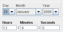
is a container for SimpleDateSelector and SimpleTimeSelector components combining the functionality of both. The components consists of six user-editable fields for year, month, day, hour, minute and seconds. All fields are validating allowing user to select only valid date and time values. These are the obtained using getDate and setDate methods.

When a new date is set the component notifies PropertyChangeListeners through property date.
DateTimeSelector

See complete javadoc.

NumberField

NumberField
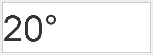
is a descendant of ResizableTextField which only allows input of numbers. Double and long number formats are supported through number document classes DobuleDocument and LongDocument, both descedents of AbstractNumberDocument, while display format is controlled using com.cosylab.util.PrintfFormat string parser.

The number field operates in two modes. When in focus mode, user can type in numbers that are recognized by the set number document of the number field. When the user presses the enter key or the component goes out of focus the typed value is checked for range using the set minimum and maximum allowed values. Value stored by the number field can be accessed through getter and setter methods in both double or long or even generic Number type.
NumberField

See complete javadoc.

SelectorGUI

SelectorGUI
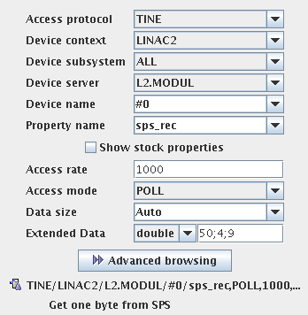
is a visual component which enables the construction of ConnectionParameters. The component consists of sevral combo boxes and input fields which allow user to configure the connection point.

Beside the regular remote point settings the customizer also supports the extended TINE data. One can decide what kind of data needs to be supplied at read request and enter the values in the field (Extended Data). The values have to be separated by semicolon (';').

When selecting a valid ConnectionParameters a SelectorGUIEvent will be triggered notifying the listeners that selection was completed.
SelectorGUI

See complete javadoc.

SelectorListGUI

SelectorListGUI
is an instance of SelectorGUI which instead of combo boxes uses lists displaying multiple values at the same time.

When selecting a valid ConnectionParameters a SelectorGUIEvent will be triggered notifying the listeners that selection was completed.
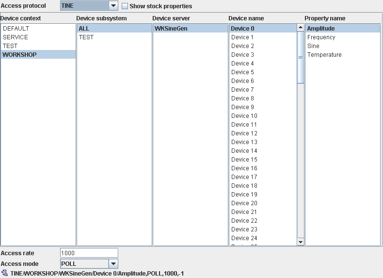
SelectorListGUI

See complete javadoc.